
Last year, our marketing team kicked off a large effort based on user research to revamp shopify.com to better serve the needs of our site visitors. We recognized that visitors wanted to see screenshots and visuals of the product itself, however we found that most of the screenshots across our website were outdated.

Old Shopify POS software on shopify.com
The above image was used to showcase our Shopify POS software on shopify.com, however it misrepresented our product when our POS software was updated and rebranded.
While we first experimented with a Scalable Vector Graphics (SVG) based solution to visuals, we found that it wouldn’t scale and forced us to restrict usage to only “high-value” pages. Still, other teams expressed interest in this approach, so we recreated these in HTML and JavaScript (JS) and compared the lift between them. The biggest question was around getting these to resize in a given container—with SVG all content, including text size, grows and shrinks proportionally with a width of 100%, appearing as an image to users. With CSS there’s no way to get font sizes to scale proportionally to a container, only the window. We created a solution that resizes all the contents of the element at the same rate in response to container size, and reused it to create a better shopify.com.
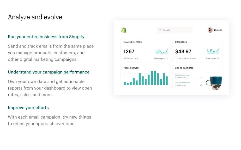
The Design Challenge
We wanted to create new visuals of our product that needed to be available and translated across more than 35 different localized domains. Many domains support different currencies, features, and languages. Re-capturing screenshots on each domain to keep in sync with all our product changes is extremely inefficient.
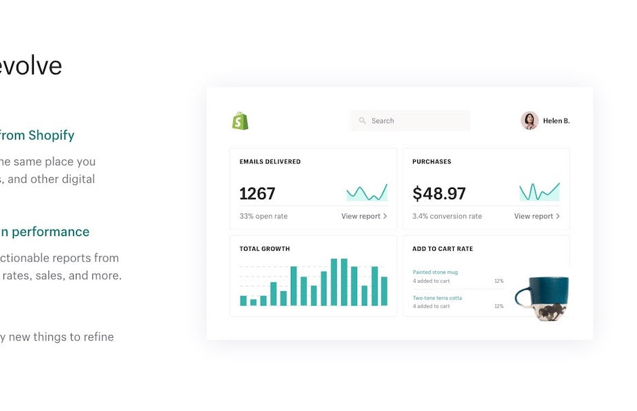
Screenshots of our product were simplified in order to highlight features relevant to the page or section.
After a number of iterations and as part of a collaborative effort outlined in more detail by Robyn Larsen on our UX blog, our design team came up with simplified representations of our user interface, UI Illustrations as we called them, for the parts of the product that we wanted to showcase. This was a clever solution to drive user focus to the parts of the product that we’re highlighting in each situation, however it required that someone maintain translations and versions of the product as separate image assets. We had an automated process for updating translations in our code but not in the design editor.
What Didn’t Work: The SVG Approach
As an experimental solution, we attempted to export these visuals as SVG code and added those SVGs inline in our HTML. Then we’d replace the text and numbers with translated and localized text.
SVGs don’t support word wrapping so visuals with long translations would look broken.
Exported SVGs were cool, they actually worked to accomplish what we had set out to do, but they had a bunch of drawbacks. Certain effects like gaussian blur caused performance issues in Firefox, and SVG text doesn’t wrap when reaching a max-width like HTML can. This resulted in some very broken looking visuals (see above). Languages with longer word lengths, like German, had overflowing text. In addition, SVG export settings in our design tool needed to be consistent for every developer to avoid massive changes to the whole SVG structure every time someone else exported the same visual. Even with a consistent export process, the developer would have to go through the whole process of swapping out text with our own hooks for translated content again. It was a huge mess. We were writing a lot of documentation just to create consistency in the process, and new challenges kept popping up when new settings in Sketch were used. It felt like we had just replaced one arduous process with another.
Our strategy of using SVGs for these visuals was quickly becoming unmanageable, and that was just with a few simple visuals. A month in, we still saw a lot of value in creating visuals as code, but needed to find a better approach.
Our Solution: The HTML/JavaScript Approach
After toying around with using JS to resize the content, we ended up with a utility we call ScaleContentAsImage. It calculates how much size is available for the visual and then resizes it to fit in that space. Let’s break down the steps required to do this.
Starting with A Simple Class
We start by creating a simple class that accepts a reference to the element in the DOM that we want to scale, and initialize it by storing the computed width of the element in memory. This assumes that we assigned the element a fixed pixel width somewhere in our code already (this fixed pixel width matches the width of the visual in the design file). Then we override the width of the element to 100% so that it can fill the space available to it.I’ve purposely separated the initialization sequence into a separate method from the constructor. While not demonstrated in this post, that separation allows us to add lazy loading or conditional loading to save on performance.
Creating an Element That We Can Transform
Next we’ll need to create an element that will scale as needed using a CSS transform. We assign that wrapper the fixed width that its parent used to have. Note that we haven’t actually added this element anywhere in the DOM yet.
Moving the Content Over
We transfer all the contents of the visual out from where it is now and into the wrapper we just created, and put that back into the parent element. This method preserves any event bindings (such as lazy load listeners) that previously were bound to these elements. At this point the content might overflow the container, but we’ll apply the transform to resolve that.
Applying the Transformation
Now, we determine how much the wrapper should scale the contents by and apply that property. For example, if the visual was designed to be 200px wide but it’s rendered in an element that’s 100px wide, the wrapper would be assigned transform: scale(0.5);.
Preserving Space in the Page
A screenshot of a webpage in a desktop view with text content aligned to the left and an image on the right.
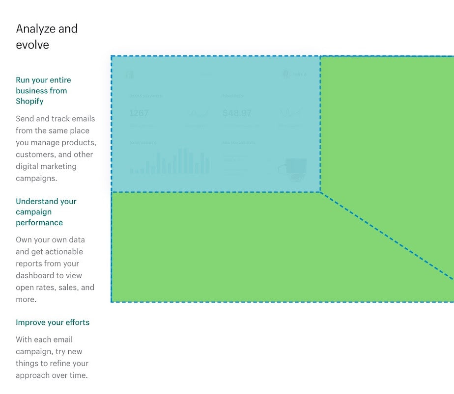
So now our visual is resizing correctly, however our page layout is now looking all wonky. Our text content and the visual are meant to display as equal width side-by-side, like the above.
So why does the page look like this? The colored highlight shows what’s happening with our CSS transform.
A screenshot of a webpage in a desktop viewport after CSS transform.
CSS transforms don’t change the content flow, so even though our visual size is reduced correctly, the element still takes up its fixed width. We add some additional logic here to fix this problem by adding an empty element that takes up the correct amount of vertical space. Unless the visual contains images that are lazy loaded, or animates vertically in some way, we only need to make this calculation once since a simple CSS trick to maintain an aspect ratio will work just fine.
Removing the Transformed Element from the Document Flow
We also need to set the transformed element to be absolutely positioned, so that it doesn’t affect the document flow.
A screenshot of a webpage in a desktop view with text content aligned to the left and an image on the right.
Binding to Resize
Success! Looks good! Now we just add a bit of logic to update our calculations if the window is resized.
Finishing theCode
Our class is now complete.
Looking at the Detailed Changes in the DOM
378px and the assigned width of the element is 757px. The available space is about 50% of the original size of the visual.

A screenshot of a page open in the browser with developer tools open
2. As seen in our HTML post-initialization, in JS we have overridden the size of the container to be 100%.
3. We’ve also moved all the content of the visual inside of a new element that we created, to which we apply a scale of 0.5 (based on the 50% calculated in step 1).
4. We absolutely position the element that we scaled so that it doesn’t disturb the document flow.
5. We added a placeholder element to preserve the correct amount of space in the document flow.
A Solution for a React Project
For a project using React, the same thing is accomplished without any of the logic we wrote to create, move, or update the DOM elements. The result is a much simpler snippet that only needs to worry about determining how much space is available within its container. A project using CSS-in-JS benefits in that the fixed width is directly passed into the element.
Problems with Localization and Currency
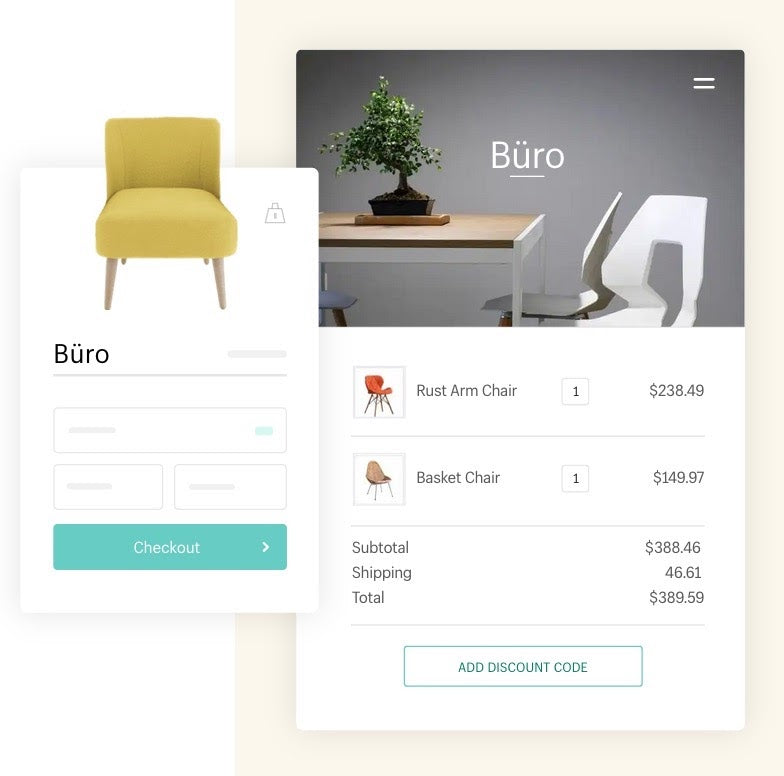
Shopify admin order summary page
An interesting problem we ran into was displaying prices in local currencies for fictional products. For instance, we started off with a visual of a product, a checkout button, and an order summary. Shown in the order summary were two chairs, each priced at ~$200, which were made-up prices and products for demonstrative purposes only.
It didn’t occur to us that 200 Japanese Yen is the equivalent of under $1.89 USD (today), so when we just swapped the currency symbol the visual of the chair did not realistically match the price. We ended up creating a table of currency conversion rates pulled on that day. We don’t update those conversion values on a regular basis, since we don’t need accurate rates for our invented prices. We’re ok with fluctuations, even large ones, as long as the numbers look reasonable in context. We obviously don’t take this approach with real products and prices.
Comparing Approaches: SVG vs HTML/JavaScript
The HTML/JS approach took some time to build upfront, but its advantages clearly outweighed the developer lift required even from the start. The UI Illustrations were fairly quick to build out given how simply and consistently they were designed. We started finding that other projects were reusing and creating their own visuals using the same approach. We created a comparison chart between approaches, evaluating major considerations and the support for these between the two.
Text Support
While SVG resizes text automatically and in proportion to the visual resizing, it didn’t support word wrap which is available in HTML
Implementation and Maintenance
HTML/JS had a lot going for compared to the SVG approach when it came to implementation and maintenance. Using HTML and JS would mean that developers don’t need to have technical knowledge of SVGs, and they code these visuals with the help of our existing components. Code is easy to parse and tested using our existing testing framework. From an implementation standpoint, the only thing that SVG really had going for it was that it usually resulted in fewer lines of code, since styles are inline and elements are absolutely positioned relative to each other. That in itself isn’t reason to choose a less maintainable and human-readable solution.
Animation
While both would support animations—something we may want to add in the future—an HTML/JS approach allows us to easily use our existing play/pause buttons to control these animations.
Accessibility
The SVG approach works with JS disabled, however it’s less performant and caused a lot of jankiness on the page when certain properties like shadows were applied to it
Design
Design is where HTML/JS really stood out against SVG. With our original SVG approach, designers needed to follow a specific process and use a specific design tool that worked with that process. For example, we started requiring that shadows applied to elements were consistent in order to prevent multiple versions of Gaussian Blur from being added to the page and creating jankiness. It also required our designers to design in a way that text would never break onto a new line because of the lack of support for word wrapping. Without introducing SVG, none of these concerns applied and designers had more flexibility to use any tools they wanted to build freely.
Documentation and Ramp-up
HTML/JS was a clear winner , as we did away with all of the documentation describing the SVG export process, design guidelines, and quirks we discovered. With HTML, all we’d need to document that wouldn’t apply to SVGs is how to apply the resize functionality to the content.
Scaling Our Solution
We started off with a set of named visuals, and designed our system around a single component that accepted a name (for example “Shopify admin dashboard” or “POS software”) and rendered the desired visual. We thought that having a single entry point would help us better track each visual and restrict us to a small, maintainable set of UI Illustrations. That single component was tested and documented and for each new visual we added respective tests and documentation.
We worried about overuse given that each UI Illustration needed to be maintained by a developer. But with this system, a good portion of that development effort ended up being the education of the structure, maintenance of documentation, and tests for basic HTML markup that’s only used in one place. We’ve since provided a more generic container that can be used to wrap any block of HTML for initialization with our ScaleContentLikeImage module and provides a consistent implementation of descriptive text for screen readers.
The Future of UI Illustrations
ScaleContentLikeImage and its application for our UI Illustrations is a powerful tool for our team to highlight our product in a very intentional and relevant way for our users. Jen Taylor dives deeper into our UX considerations and user-focused approach to UI Illustrations on the Shopify UX Blog. There are still performance and structural wins to be had, specifically around how we recalculate sizing for lazy loaded images, and how we document existing visuals for reuse. However, until there’s a CSS-only solution to handle this use case our HTML/JS approach seems to be the cleanest. Looking to the future, this could be an excellent application to explore with CSS Houdini once the layout API is made available (it’s not yet supported in any major browser).
Based on Anton Dosov’s CSS Houdini with Layout API demo, I can imagine a scenario where we can create a custom layout renderer and then apply this logic with a few lines of CSS.
We’ve all learned a lot in this process and like any system, its long term success relies on our team’s collaborative relationship in order to keep evolving and growing in a maintainable, scalable way. At Shopify one of our core values is to thrive on change, and this project certainly has done so.
If sounds this sounds like the kind of projects you want to be a part of please check out our open positions.